SwiftUI: Equal Width Icons
2 February 2023 • Development • Swift • SwiftUIFollowing on from my previous post on SwiftUI Text alignment, I thought I’d post about another common issue I run into and how to solve it relatively simply: equal width icons. This logic applies to any series of Views you want to display equally in either height or width, but the most common place it occurs in my own code is when using SF Symbols. Each symbol has its own width, so when using them as bullets or in other situations where you want them to line up it can be infuriating.
Let’s set the stage with some code. The example I’m using is the ubiquitous “What’s New” sheet, found in many of Apple’s own apps. I’ve borrowed the text and icons from the latest update to Penedex, a pen-tracking app developed by Connor Rose. Here’s the sample View:
struct EqualWidthIcons: View {
    var body: some View {
        VStack(spacing: 20) {

            VStack {
                Text("What's New!")
                    .font(.largeTitle)
                    .bold()
                Text("Version 2023.01")
            }
            .padding(.bottom)

            HStack(alignment: .top) {
                Image(systemName: "star.circle.fill")
                    .font(.title)
                    .foregroundColor(.yellow)
                VStack(alignment: .leading) {
                    Text("Star Ratings Toggle")
                        .font(.headline)
                    Text("If you believe all your pens are your favourite, you can now turn off star ratings via Settings.")
                }
                .fullWidth()
            }

            HStack(alignment: .top) {
                Image(systemName: "square.and.arrow.up.fill")
                    .font(.title)
                    .foregroundColor(.green)
                VStack(alignment: .leading) {
                    Text("Share Sheet Fix")
                        .font(.headline)
                    Text("Fixed an issue where the date in your Currently Ink'd shared image would not display correctly.")
                }
                .fullWidth()
            }

            HStack(alignment: .top) {
                Image(systemName: "scroll.fill")
                    .font(.title)
                    .foregroundColor(.blue)
                VStack(alignment: .leading) {
                    Text("Brand List Fix")
                        .font(.headline)
                    Text("Fixed issues with duplicate brands populating your Brand List.")
                }
                .fullWidth()
            }

            HStack(alignment: .top) {
                Image(systemName: "ladybug.fill")
                    .font(.title)
                    .foregroundColor(.red)
                VStack(alignment: .leading) {
                    Text("Misc. Bug Fixes")
                        .font(.headline)
                    Text("Plenty of other minor improvements.")
                }
                .fullWidth()
            }

            Spacer()
        }
        .padding()
    }
}
A series of repeated sections (don’t worry, it’ll be much neater by the end of the post), each with an icon, a title and a short summary. It makes use of the fullWidth() modifier from my previous post. This is how iOS renders it:
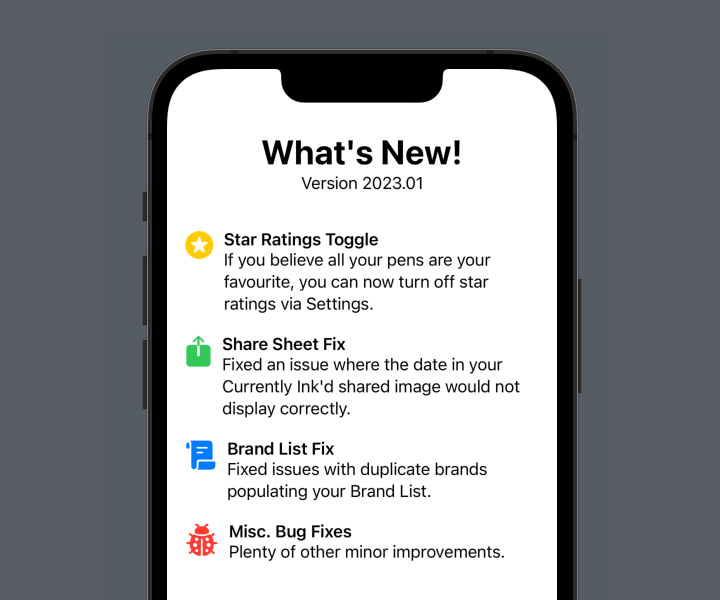
As a starter for ten, this is pretty good! But the scroll icon is wider than the previous two, and the ladybird icon even wider still. This pushes the text out to the right and it no longer lines up. We could manually define a width for the icon:
HStack(alignment: .top) {
    Image(systemName: "square.and.arrow.up.fill")
        .font(.title)
        .foregroundColor(.green)
        .frame(width: 50)
    VStack(alignment: .leading) {
        Text("Share Sheet Fix")
            .font(.headline)
        Text("Fixed an issue where the date in your Currently Ink'd shared image would not display correctly.")
    }
    .fullWidth()
}
(From now on, I’m only going to show the code for one of the four sections. The others are identical in all but the content.)
Yay, that works!
But it’s a bit of a “magic number”, and one that would likely need to be tweaked should you change the icons at a later date. Not to mention that it just won’t scale with the icon if the user adjusts the text size on their iOS device. We can do better than that.
There’s three parts to the solution. We need to:
- read the width of each icon,
- store the maximum of those widths somewhere, and
- set the width of each icon to that maximum.
Let’s take these one at a time.
Read the width of each icon
This is easily achieved using a GeometryReader. I have a bit of a love/hate relationship with this SwiftUI utility, but in this case it works very well. Appyling it as a background to the icon means it will grow to match the size of the icon’s view, and we can read the frame’s size:
Image(systemName: "square.and.arrow.up.fill")
    .font(.title)
    .foregroundColor(.green)
    .background {
        GeometryReader { geo in
            // geo.size.width is the width of the icon
        }
    }
But what we can do with that value?
Store the maximum width
In order to calculate the maximum, we need a couple of things. We need a State variable for the max icon width, and let’s give it a sensible default:
@State private var iconWidth: CGFloat = 20
And we need a way to accumulate the values read by each GeometryReader and take the maximum for our iconWidth variable. SwiftUI provides us with just the thing: a PreferenceKey. This is a strange bit of SwiftUI that allows us to combine a number of values into a single one, and store it somewhere. First, we need to define a custom PreferenceKey, with a reduce function that returns the maximum of the values it is passed. I like to do this on an extension of the main view:
private extension EqualWidthIcons {
    struct IconWidthPreferenceKey: PreferenceKey {
        static let defaultValue: CGFloat = 0
        static func reduce(value: inout CGFloat, nextValue: () -> CGFloat) {
            value = max(value, nextValue())
        }
    }
}
The code here is a little odd, but the important part is the call to max, setting the value variable to the maximum of either what it was before, or the value it has just been passed (the result of the nextValue() call).
Now we need to use this PreferenceKey in our GeometryReader. To do so, we have to call .preference(key:value:) on a View. We can place an invisible view in the GeometryReader and use it there:
Image(systemName: "square.and.arrow.up.fill")
    .font(.title)
    .foregroundColor(.green)
    .background {
        GeometryReader { geo in
            Color.clear.preference(key: EqualWidthIcons.IconWidthPreferenceKey.self, value: geo.size.width)
        }
    }
Applying this to each icon will propagate the maxiumum size up into our EqualWidthIcons.IconWidthPreferenceKey.
Set the width of each icon
Now all that’s left is to set the width of each icon to that maximum. Remember the State variable we created for it previously? We can watch for changes to the PreferenceKey and update it accordingly. I like to do this on the highest view in the hierarchy, the immediate one returned by body (in this case, that’s the outer VStack):
var body: some View {
    VStack {
        // Rest of view...
    }
    .onPreferenceChange(EqualWidthIcons.IconWidthPreferenceKey.self) { value in
        self.iconWidth = value
    }
}
Finally, update each icon to use this value as its width. It’s important that we set the frame after the GeometryReader background.
Image(systemName: "square.and.arrow.up.fill")
    .font(.title)
    .foregroundColor(.green)
    .background {
        GeometryReader { geo in
            Color.clear.preference(key: EqualWidthIcons.IconWidthPreferenceKey.self, value: geo.size.width)
        }
    }
    .frame(width: iconWidth)
And voila! Each icon has the same width, and will scale along with dynamic type as specified by the user.

Cleaning up
This works great, but we have a fair bit of duplicated code. We did already, but since we’ve added the background, GeometryReader, and frame definitions, the sections have become fairly unwieldy. It’s probably time we split it out into its own view:
struct WhatsNewSection: View {

    let icon: String
    let iconColor: Color
    let title: String
    let summary: String

    var body: some View {
        HStack(alignment: .top) {
            Image(systemName: icon)
                .font(.title)
                .foregroundColor(iconColor)
                .background {
                    GeometryReader { geo in
                        Color.clear.preference(key: EqualWidthIcons.IconWidthPreferenceKey.self, value: geo.size.width)
                    }
                }
//              How do we read the iconWidth here?
//              .frame(width: iconWidth)
            VStack(alignment: .leading) {
                Text(title)
                    .font(.headline)
                Text(summary)
            }
            .fullWidth()
        }
    }

}
This dramatically reduces the size of the original view:
struct EqualWidthIcons: View {

    @State private var iconWidth: CGFloat = 20

    var body: some View {
        VStack(spacing: 20) {

            VStack {
                Text("What's New!")
                    .font(.largeTitle)
                    .bold()
                Text("Version 2023.01")
            }
            .padding(.bottom)

            WhatsNewSection(icon: "star.circle.fill", iconColor: .yellow, title: "Star Ratings Toggle", summary: "If you believe all your pens are your favourite, you can now turn off star ratings via Settings.")
            WhatsNewSection(icon: "square.and.arrow.up.fill", iconColor: .green, title: "Share Sheet Fix", summary: "Fixed an issue where the date in your Currently Ink'd shared image would not display correctly.")
            WhatsNewSection(icon: "scroll.fill", iconColor: .blue, title: "Brand List Fix", summary: "Fixed issues with duplicate brands populating your Brand List.")
            WhatsNewSection(icon: "ladybug.fill", iconColor: .red, title: "Misc. Bug Fixes", summary: "Plenty of other minor improvements.")

            Spacer()

        }
        .padding()
        .onPreferenceChange(EqualWidthIcons.IconWidthPreferenceKey.self) { value in
            self.iconWidth = value
        }
    }
}
But you may have noticed the question in the comments in the WhatsNewSection code: where do we read iconWidth from now?
We have to pass it down as a binding from the parent view:
struct WhatsNewSection: View {
    let icon: String
    let iconColor: Color
    let title: String
    let summary: String
    @Binding var iconWidth: CGFloat
    // Rest of view...
Read it as usual to set the icon’s frame:
Image(systemName: icon)
    .font(.title)
    .foregroundColor(iconColor)
    .background {
        GeometryReader { geo in
            Color.clear.preference(key: EqualWidthIcons.IconWidthPreferenceKey.self, value: geo.size.width)
        }
    }
    .frame(width: iconWidth)
And finally, pass the binding through from the main view:
WhatsNewSection(icon: "star.circle.fill", iconColor: .yellow, title: "Star Ratings Toggle", summary: "If you believe all your pens are your favourite, you can now turn off star ratings via Settings.", iconWidth: $iconWidth)
A better alternative
For this particular situation, we can actually do away with the PreferenceKey entirely, if we switch our layout to using a Grid. Grids automatically size the width of their columns based on the widest cell within the column, which is exactly what we want. Here’s a verison of the code using Grid instead:
struct WhatsNewGridRow: View {
    let icon: String
    let iconColor: Color
    let title: String
    let summary: String

    var body: some View {
        GridRow(alignment: .top) {
            Image(systemName: icon)
                .font(.title)
                .foregroundColor(iconColor)
            VStack(alignment: .leading) {
                Text(title)
                    .font(.headline)
                Text(summary)
            }
            .fullWidth()
        }
    }

}

struct GridWidthIcons: View {
    var body: some View {
        VStack(spacing: 20) {
            VStack {
                Text("What's New!")
                    .font(.largeTitle)
                    .bold()
                Text("Version 2023.01")
            }
            .padding(.bottom)

            Grid(horizontalSpacing: 10, verticalSpacing: 10) {
                WhatsNewGridRow(icon: "star.circle.fill", iconColor: .yellow, title: "Star Ratings Toggle", summary: "If you believe all your pens are your favourite, you can now turn off star ratings via Settings.")
                WhatsNewGridRow(icon: "square.and.arrow.up.fill", iconColor: .green, title: "Share Sheet Fix", summary: "Fixed an issue where the date in your Currently Ink'd shared image would not display correctly.")
                WhatsNewGridRow(icon: "scroll.fill", iconColor: .blue, title: "Brand List Fix", summary: "Fixed issues with duplicate brands populating your Brand List.")
                WhatsNewGridRow(icon: "ladybug.fill", iconColor: .red, title: "Misc. Bug Fixes", summary: "Plenty of other minor improvements.")
            }

            Spacer()
        }
        .padding()
    }
}
The result is identical, with a little less code a lot less complexity. However, there are still some situations where you want icons or other views to match widths or heights but a grid isn’t appropriate—there may be other content between the views, for example, that you don’t want conforming to a grid—so the PreferenceKey method is still valuable to know.
The full code for both solutions can be found on Github.